Can you quickly recall the most surprising, top branding and corporate identity design examples from the last year from some of your favorite brands? There is nothing hard and fast, but let’s just focus on ‘best company logos ‘only. For your ease of memory, we have chopped down some of the most popular solid branding and identity design inspirations that you might don’t know yet. These mastermind inspirations will make everyone blow out of this universe for sure!
1. Airbnb
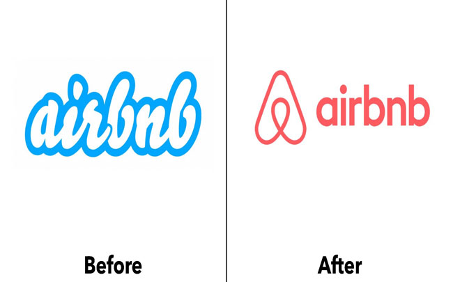
It was a few years back that the traditional Airbnb group decided to play something nice &new with their logo so, they rang up a famous design studio based in San Francisco and begged for some help.
The design studio gave them with a very realistic logo but superficially, a controversial debate point for both inside and out for the brand and fan-followers to talk about socially and as happen with many worst and great logo design scenarios, after some time passed, its easy to look back and say ‘forget it ‘ or ‘I can recall it ”, Airbnb decision was right to move away from that out of trend, script logotype into a more stylized icon”A.”
You May Also Like
- How Social Media Can transform today’s Brand Logo Designs?
- 6 Things Weddings Should Always Include
- Pull Off Comfortable Yet Stylish Clothing
2. Spotify
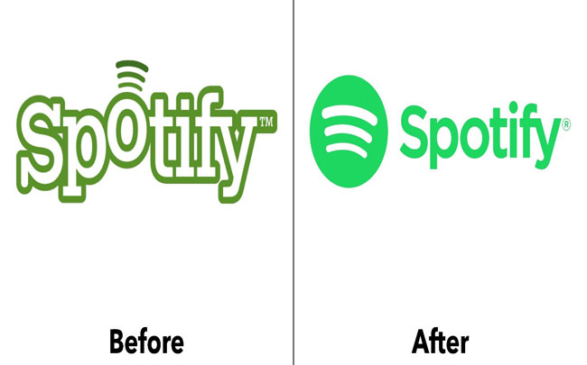
Spotify, the Swedish-based music station brand, has been remarkable throughout its journey of corporate logo design to inspire its storm of music-lovers,
The original branding emerged with a non-native foreigner logotype dressed in a funky “O” lifted up, with radio wavelengths coming out of it. Unfortunately, the design didn’t much rock-on but the brand didn’t give up on this.
Later on, in 2013, it again underwent a more serious re-branding attempt with a design focusing on more 3-D green & white music impression but looked more’ fake’; this time.
Finally, in 2015, a brand consultancy group Collins took the challenge in their hands and design a unique logo design that was much refined than the 2013’s version, with a catchier color palette and green color texture highlighted all over successive use of duotone technique, gradient effects and pop art graphics that seriously knocked Spottily out of the park this time
3. Australian Open

‘Australian Open’ went through a rebranding attempt in the year 2016 by the most popular agency designers of Landor Australia. Very intelligently, the top logo designers tore away the ‘ex- logo design’ identity with an overhauling look, by eliminating all the visual references that made the logo more biased towards tennis players or tennis balls and simply, chopped it down to just a mark lettering ‘AO”.
They, even more, simplified the crossbars complexing the letter ‘A’ and applied the circles and delta shapes effects across all the other branding collaterals. The end- product was a branding system that was lively, fun, energetic and bold with a stiff-free new logo identity!!
4. City Of Melbourne
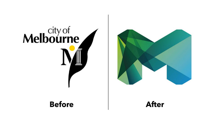
Melbourne got sued for its safe, simple and predictable city logo by its people for being so much city-lists, i.e, embedded all in city logo things.
C’mon!
If you are having a nick labeling city that doesn’t mean to officially make this as a universal logo symbol to bore your people. The logo used to be a damn official- looking and visually serious symbol for its viewers. The brand luckily realized this and in 2009, it decided to knock out every cap of its ‘city’ label with a new identity system that can actually look energize and fantastic and they succeeded!
The new logo design is simply fabulous and a genius with positive changes for the branding of the city in three ways: Firstly, it portrayed the appealing culture of Melbourne. Secondly, it was a nut-shell for all of its past logos that existed so far and thirdly, it created a universal visual language to be recognized across every communications and marketing channel for maximum brand reach.
5. Heart & Stroke
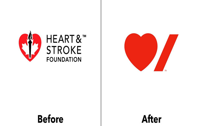
The recently released logo by the ‘Heart & Stroke’ foundation is a masterpiece of minimalism and digital reduction. Design courtesy goes to Pentagram’s famous Paula Scher, who trim-off a very officially, busy- looking logo piece into a distilled identity for perfect message delivery across its masses.
The stroke mark is now more neatly positioned under the curve of the’ heart ‘with the genius, compact typography that is snuggled to break-off the rules under the ‘stroke ‘. The Heart & Stroke logo symbol truly stands out and is ready to be nominated as a multi-functional logo inspiration for every industry new-comer to follow!!